During the developement of Halo 3, Bungie came up with different Halo 3 logos and posted a few of them in their website. Thanks to HBO for archiving the updates! [Image informations written by Frank O’Connor, former Bungie employee]
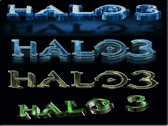
“The next step is to explore how the letters should look in a 3D, rendered form. The image below shows just a handful of the concepts that were kicked around during several weeks of iteration and review. Dozens upon dozens of variations were sent back and forth between Bungie, Microsoft and the creative agency. Some were very similar, some were extremely different, like the angled, green variation below, affectionately nicknamed, “The Hulk.”
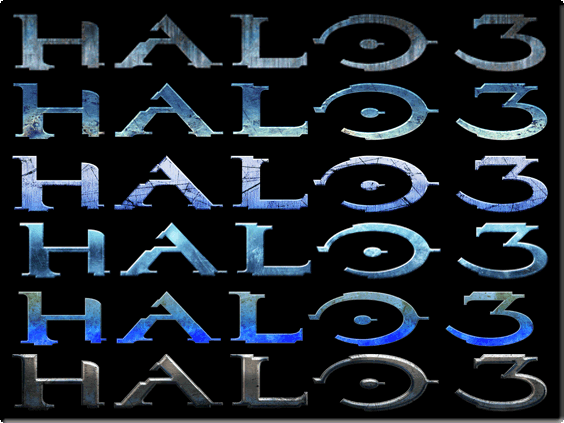
“Once we landed on a 3D rendered logo that everyone liked, the final step is to explore the textures and colors for the final logo. Again, dozens upon dozens of concepts were sent through the loop until we landed on the version that everyone liked. Knowing that ultimately the Halo 3 logo wasn’t going to stray too far from what has come before it, the texture and color were the areas with the most opportunity for differentiation.”
What do you think about this unseen game? Give your vote!

 (4 votes, average: 4.25 out of 5)
Would you like to add more info, screens or videos to this page? Add a comment below!
- Quark (Quantic Dream) [Dreamcast – Cancelled] - 24-03-2024
- Fortris [PC/Playstation/Dreamcast – Cancelled] - 09-03-2024
- Gorkamorka [PC / Dreamcast – Cancelled] - 16-12-2023